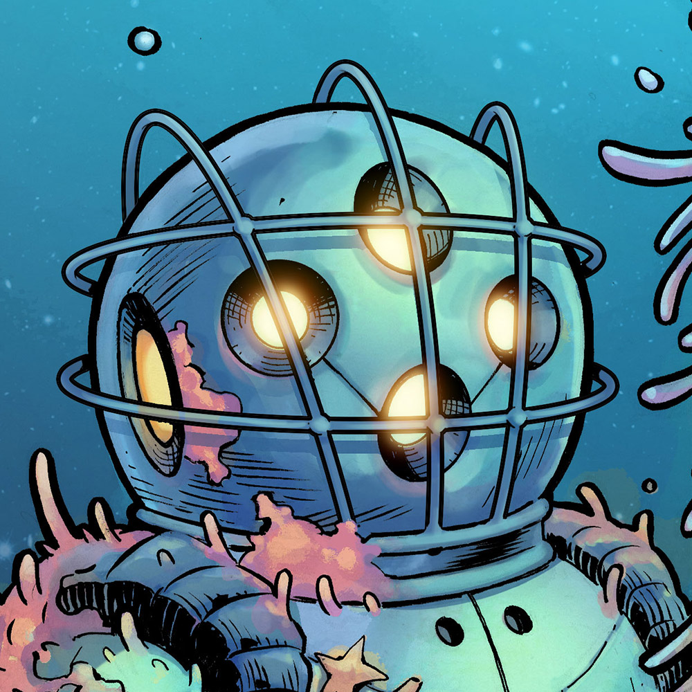
I contributed the following piece to Project: Rooftop’s Spider-Man 2.0 redesign. The old Web-head has been one of my favorite characters since I first got hooked on Todd McFarlane’s art during his Spider-Man run in my teens.
They’ve announced the honorable mentions as well as 2nd and 3rd place winners, so I’m going to assume it’s safe to post this here, as I doubt I won the thing after seeing some of the other designs that were submitted.
Still, it was a blast to participate and really took me back to when I first started reading comics. I’m definitely going to be doing more of these redesigns in the future.


Bring em on! This is a solid design and it works for the character. I’d have to say the globelike eyes are a bt much (Being able to see them from the back is what got me), and i’d have made the head full on blue, with the spider being red, as all that white in the middle looks off on Spidey. But this is a great illustration and you did a great job of showing Spidey in it in different poses.
I certainly hope to see more redesigns from you.
From a guy that is easily distracted by art in comics and reads probably way too much Spider-man, you easily have one of my favorite Spidey styles! Actually, for me you capture spiderman in what I know of Spidey. You, Chris Bachalo, Clayton Crain, and Mcfarlin are my favorites.
Now that I’m on it. I’d luv to see any entire Spiderman with you at the helm.